
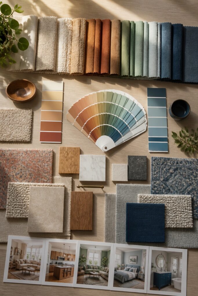
A cohesive home colour scheme begins with quiet confidence. Soft whites and warm beiges establish the neutral groundwork that everything else builds upon. From there, personality emerges through carefully chosen accents in textiles, artwork, and decorative objects.
Lighting deserves serious attention during this process. Natural daylight shifts dramatically from morning to evening, while artificial sources cast their own subtle tints. Testing paint samples at different times prevents costly surprises. Most homeowners skip this step, then wonder why their chosen grey reads purple after sunset.
The technical side matters too. Selecting a colour harmony method, whether complementary, analogous, or monochromatic, provides necessary structure. Room-by-room mapping ensures each space converses with the next rather than shouting over it.
Walking through your home should feel like turning pages of a well-edited book.
Yet even thoughtful planning faces pitfalls. Common coordination mistakes, from ignoring undertones to overusing trendy statement colours, can fragment the overall effect. Recognizing these traps before they happen saves both money and regret.
The goal remains a home that feels intentionally connected, not decorated by accident.
Establish Your Neutral Anchor Colour
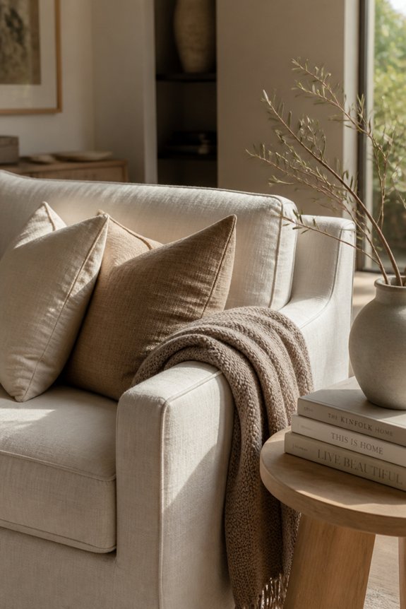
The foundation of any whole-home colour scheme rests on selecting a neutral anchor colour, which serves as the primary backdrop throughout the living spaces. Common choices include soft whites, warm beiges, light grays, and pale taupe. These colours provide visual continuity, allowing accent colours to stand out without overwhelming the environment.
Neutral anchors work well on walls, larger furniture pieces, and flooring throughout hallways and main rooms. They create calm, cohesive backdrops that flow seamlessly between spaces. Selecting one neutral tone and applying it consistently across multiple rooms establishes unity while maintaining flexibility for adding personality through accent colours, artwork, and accessories in different areas.
Account for Lighting in Your Colour Choices
Once neutral anchor colours are in place, the amount and quality of light in each room becomes the next consideration affecting how those colours actually appear. Natural light from windows shifts throughout the day, altering how beige or greige walls look during morning versus evening hours.
Artificial lighting also impacts perception: warm bulbs enhance yellow undertones, while cool bulbs emphasize blue undertones. Rooms with limited natural light benefit from lighter neutrals that reflect available light. South-facing spaces with abundant sunlight tolerate deeper neutral shades.
Testing paint samples at different times and under various lighting conditions guarantees colour selections remain consistent across the home.
Choose Your Colour Harmony Method
How should one select colors that work together throughout a home? Several established methods guide this selection process.
The complementary scheme uses opposite colors on the color wheel, creating contrast and visual interest. Analogous schemes employ neighboring colors, producing harmony and cohesion. Triadic approaches select three equally-spaced colors for balanced variety. Monochromatic schemes use single-color variations, offering sophisticated simplicity.
Homeowners might consider their existing furniture, flooring, and artwork when choosing a method. A scheme’s success depends on thoughtful application across rooms, accounting for how each method affects the home’s overall flow and atmosphere.
Layer in Accent Colours Strategically
After establishing a foundational color harmony method, homeowners can refine their scheme by incorporating accent colors in specific areas. Accent colors add visual interest and depth without overwhelming the space. Strategic placement in entryways, feature walls, or kitchen islands introduces controlled variation.
Common accent choices include jewel tones like emerald or sapphire, warm terracotta, or deep charcoal. These colors work best when limited to approximately 10-15% of each room’s palette. Accessories, artwork, and textiles provide flexible accent options. Doors, trim, or a single wall can also serve as accent features, allowing easy adjustments as preferences evolve.
Test Your Colours Before Committing
Before painting walls or purchasing large furniture pieces, homeowners should test colors in their actual spaces to confirm satisfactory results. Sample swatches on multiple walls, observing how natural light, artificial lighting, and adjacent colors influence appearance throughout the day.
Paint large cardboard sections with candidate colors, positioning them in different rooms and lighting conditions. Note how morning sunlight, afternoon brightness, and evening lamp light affect perception. Test colors against existing flooring, cabinetry, and trim.
Allow samples to dry completely, as wet paint appears darker than the final result. This testing phase prevents costly mistakes and verifies chosen colors function harmoniously within the home’s specific environment.
Map Your Colour Scheme Room by Room
Once colors have been tested and confirmed suitable, homeowners should plan how each shade functions across different rooms and spaces. Living areas benefit from warm neutrals like beige or soft gray, creating calm environments. Kitchens work well with crisp whites or light blues, promoting cleanliness and clarity. Bedrooms suit muted pastels or deeper tones, encouraging relaxation.
Bathrooms function best with bright whites or cool grays, suggesting freshness. Hallways connect spaces effectively using connecting colors linking adjacent rooms. Creating a room-by-room map guarantees consistency while allowing appropriate adjustments. This systematic approach prevents jarring color shifts, maintains visual flow, and establishes coherence throughout the home. Documentation helps track selections for future reference.
Fix Common Colour Coordination Mistakes
Even with careful planning, homeowners frequently encounter coordination errors that disrupt visual harmony throughout their homes. Common mistakes include using too many competing colors, which overwhelms spaces and creates visual chaos. Another frequent error involves ignoring lighting conditions, as artificial and natural light alter how colors appear.
Mismatched undertones between rooms cause abrupt shifts, particularly when warm and cool palettes clash unexpectedly. Additionally, neglecting to test paint samples in actual rooms leads to color disappointment. Overusing bold accent colors reduces their impact and creates an unbalanced aesthetic.
Addressing these errors requires reviewing color relationships, reconsidering lighting effects, and ensuring undertone consistency across adjacent spaces.
Frequently Asked Questions
How Do I Choose a Colour Scheme That Will Appeal to Future Buyers if I Sell?
Future buyers appreciate neutral, timeless color palettes. Sellers should select soft whites, grays, and beiges throughout primary living spaces. These versatile foundations allow prospective purchasers to envision personal style while maintaining broad market appeal and perceived cleanliness.
Can I Use Multiple Neutral Anchor Colours Throughout Different Areas of My Home?
Like threads of different textures weaving through fabric, multiple neutral anchors can work throughout a home. However, one should guarantee that shifts flow naturally between spaces, maintaining visual continuity rather than appearing disjointed or intentionally segmented.
What’s the Best Way to Transition Colour Schemes Between Open-Concept Living Spaces?
One shifts color schemes in open-concept spaces by using a shared neutral base throughout, then introducing accent colors that vary subtly between zones. Layering similar tones creates visual separation while maintaining cohesion without hard boundaries.
How Often Should I Update My Whole-Home Colour Scheme to Stay Current With Trends?
One should update accent colors every 3-5 years to reflect evolving trends, while keeping foundational neutral tones consistent. This balance maintains visual coherence without requiring costly, extensive renovations throughout the residence.
Should My Colour Scheme Match My Furniture, or Should Furniture Adapt to Colours?
A cohesive colour scheme functions best when both elements work together. Ideally, one selects wall colours first, then chooses furniture that complements them. However, existing furniture pieces can anchor the palette, with walls adapting accordingly for visual harmony.
Conclusion
Building a cohesive whole-home colour scheme requires restraint, ironically, since most people assume more colour creates visual interest. By establishing neutral anchors, accounting for lighting, selecting a harmony method, layering accents strategically, testing samples, mapping rooms, and avoiding common mistakes, homeowners achieve cohesion through limitation. The paradox remains: constraining colour choices produces spaces that feel intentional, balanced, and expansive, proving that less colour often communicates more design sophistication.