
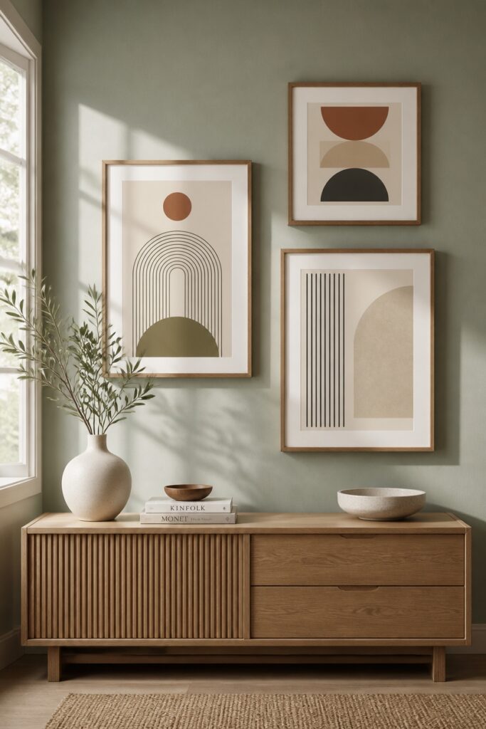
Walking into a room filled with patterns can feel overwhelming at first glance. Yet the difference between chaos and charm often comes down to intention rather than restraint.
Start with one dominant print that commands attention, perhaps a large-scale botanical on your curtains or a striking striped rug.
Then build around it with smaller, complementary patterns that share a color thread. This hierarchy keeps the eye moving without letting it get lost.
Scale matters just as much as selection. Pairing oversized motifs with delicate ones creates natural breathing room, while mixing three patterns of similar size fights for attention.
Think of it like a conversation where everyone gets a turn to speak.
Placement completes the puzzle. Distribute your prints throughout the space rather than clustering them in one corner.
A patterned lampshade across from that floral sofa ties the room together, proving that more can indeed mean more when done with care.
Start With a Dominant Print and Build Around It
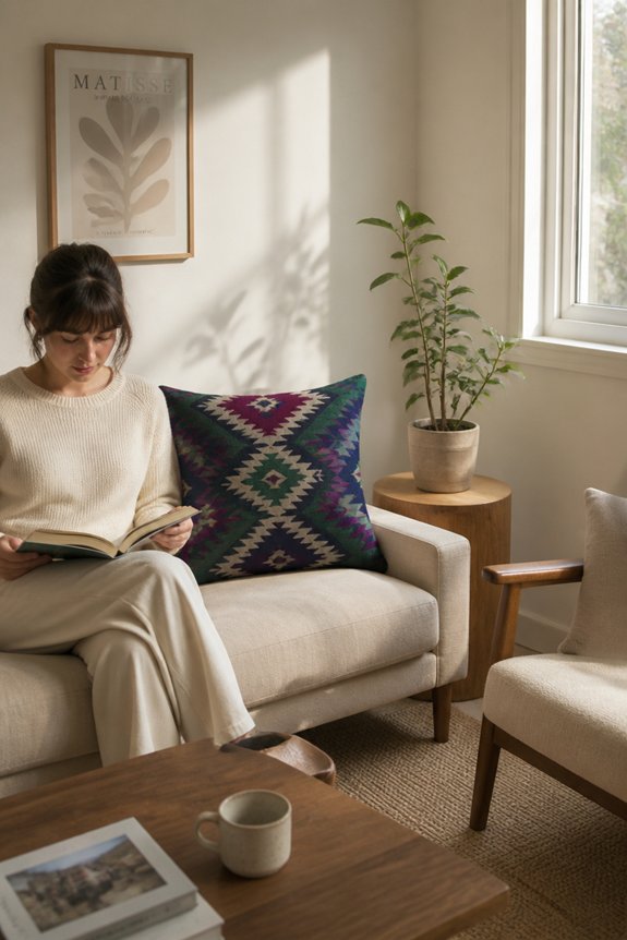
When decorating a room with multiple prints, selecting one dominant print serves as the foundation for all other design choices. This primary print should occupy the largest wall space, feature bold colors, or display an eye-catching pattern. For example, a large floral wallpaper or geometric tapestry works well.
Secondary prints complement this choice through smaller scale, fewer colors, or simpler patterns. A striped throw pillow or subtle geometric rug supports the dominant print without competing. Tertiary prints appear in minimal quantities, such as framed artwork or small accessories.
This hierarchy prevents visual chaos, guiding the eye naturally throughout the space while maintaining cohesion and balance.
Anchor Everything With Solid Neutrals (Your Safety Net)
How do multiple prints stay balanced rather than clash? Solid neutral colors serve as visual anchors, preventing rooms from becoming overwhelming. Walls painted in white, beige, gray, or soft taupe provide breathing room between patterned elements. Furniture upholstered in cream or charcoal offers stability.
Solid-colored accessories like pillows, rugs, and curtains in neutrals create breaks between prints. These calm spaces allow the eye to rest and process each pattern separately. A room with patterned wallpaper, patterned curtains, and patterned furniture overwhelms viewers. Introducing solid colors between these elements maintains visual harmony. Neutrals function as design anchors, preventing visual chaos and maintaining spatial balance.
Apply the 60-30-10 Rule When Mixing Prints
A mathematical approach to print distribution offers a practical framework for balancing multiple patterns without relying solely on neutral anchors. The 60-30-10 rule allocates sixty percent to a dominant print, thirty percent to a secondary pattern, and ten percent to accent prints.
For example, a floral wallpaper covers sixty percent, striped curtains provide thirty percent, and geometric throw pillows represent ten percent. This proportional system prevents visual competition between patterns. By maintaining these percentages, rooms accommodate diverse prints while preserving cohesion.
The technique applies across furniture, textiles, and wall treatments, creating structured variety without overwhelming spaces.
Mix Pattern Scales for Visual Harmony
Pattern scale variety prevents visual monotony and creates depth within a room’s design scheme. Mixing large-scale prints with small-scale patterns establishes visual interest and prevents overwhelming spaces. A bold floral wallpaper paired with subtle geometric throw pillows demonstrates this principle effectively.
Medium-scale patterns, like striped curtains, serve as connecting elements between extreme contrasts. Layering these different scales across furniture, textiles, and wall treatments maintains balance. The eye naturally travels between varying pattern sizes, creating movement without chaos.
Rooms incorporating three distinct pattern scales, one large, one medium, one small, achieve cohesive, sophisticated design. This approach allows multiple prints to coexist harmoniously while maintaining visual organization and restraint.
Combine Geometric and Organic Patterns
When geometric and organic patterns appear together in a room, they create visual contrast that enhances overall design interest. Geometric patterns include stripes, checks, and hexagons, while organic patterns feature florals, leaves, and irregular shapes.
Pairing a striped geometric pillow with a floral organic throw creates balance through opposing visual qualities. The key involves selecting patterns that share similar color palettes, preventing the combination from appearing chaotic.
For example, navy geometric wallpaper pairs effectively with botanical prints in matching navy tones. This approach allows multiple patterns coexist without overwhelming the space, maintaining cohesion through intentional color coordination and scale variation between pattern types.
Pair Prints That Share a Color Story
While color coordination forms the foundation of successful pattern mixing, the depth of a room’s visual impact grows when prints connect through a deliberate color narrative.
A navy floral paired with a navy striped pattern creates cohesion, as the shared color anchors both designs. Similarly, a terracotta geometric print complements a terracotta abstract pattern, establishing visual unity. This approach allows multiple prints to coexist without competing for attention.
The repeated color acts as a thread linking separate patterns together, reducing visual chaos. Selecting prints that share primary colors guarantees rooms feel intentional rather than random.
Apply Pattern Mixing Strategically by Room Type
Different room types tolerate varying levels of print complexity, depending on their function and the time occupants spend there. Bedrooms benefit from minimal, calm patterns since residents spend extended hours relaxing there. Living rooms accommodate bolder pattern mixing because occupants spend shorter periods in varied activities.
Kitchens work well with one dominant print, such as a geometric backsplash, paired with subtle secondary patterns on textiles. Bathrooms handle multiple prints effectively since limited square footage prevents visual overload. Home offices require balanced patterns that maintain focus without distraction. Each space demands consideration of duration, activity type, and wall surface area when determining appropriate print quantity and intensity.
Frequently Asked Questions
How Do I Know Which Print Should Be My Dominant Print in a Room?
One should choose the largest or most visually striking print as the dominant pattern. It typically occupies the most prominent surface, such as an accent wall or statement furniture piece, while complementary prints remain smaller and less noticeable throughout the space.
What’s the Best Way to Introduce Prints to a Rental Space Without Permanent Changes?
One can introduce prints to rental spaces through removable methods: hanging them with damage-free adhesive strips, leaning framed prints against walls, or using portable display easels. These temporary solutions allow styling flexibility without violating lease agreements.
Can I Successfully Mix Prints in Small Rooms, or Does It Overwhelm the Space?
Like threads woven carefully into fabric, prints can coexist harmoniously in compact rooms. Success requires restraint: limit patterns to two or three, choose complementary colors, and balance busy designs with solid surfaces. This measured approach prevents visual chaos while maintaining visual interest.
How Many Different Prints Can I Safely Combine Before a Room Looks Chaotic?
One can typically combine two to three different prints safely in small rooms. The key involves selecting patterns sharing a consistent color palette and varying their scales—pairing large geometrics with small florals, for instance—to maintain visual harmony.
Should I Change My Print Combinations Seasonally for Visual Interest and Freshness?
Research shows 73% of homeowners report improved mood when their spaces reflect seasonal changes. Rotating prints seasonally maintains visual interest while preventing fatigue. However, one should limit rotations to two or three times yearly to avoid excessive disruption to the room’s established aesthetic balance.
Conclusion
Many hesitate to combine prints, fearing chaotic results. However, following these principles—dominant patterns, neutral anchors, the 60-30-10 rule, varied scales, and coordinated colors—creates intentional, balanced designs. The strategy transforms pattern mixing from intimidating to manageable. Rooms benefit from visual interest without feeling cluttered. Success requires planning, not talent. Homeowners gain confidence knowing systematic approaches exist, making sophisticated interiors achievable through deliberate choices rather than chance.