
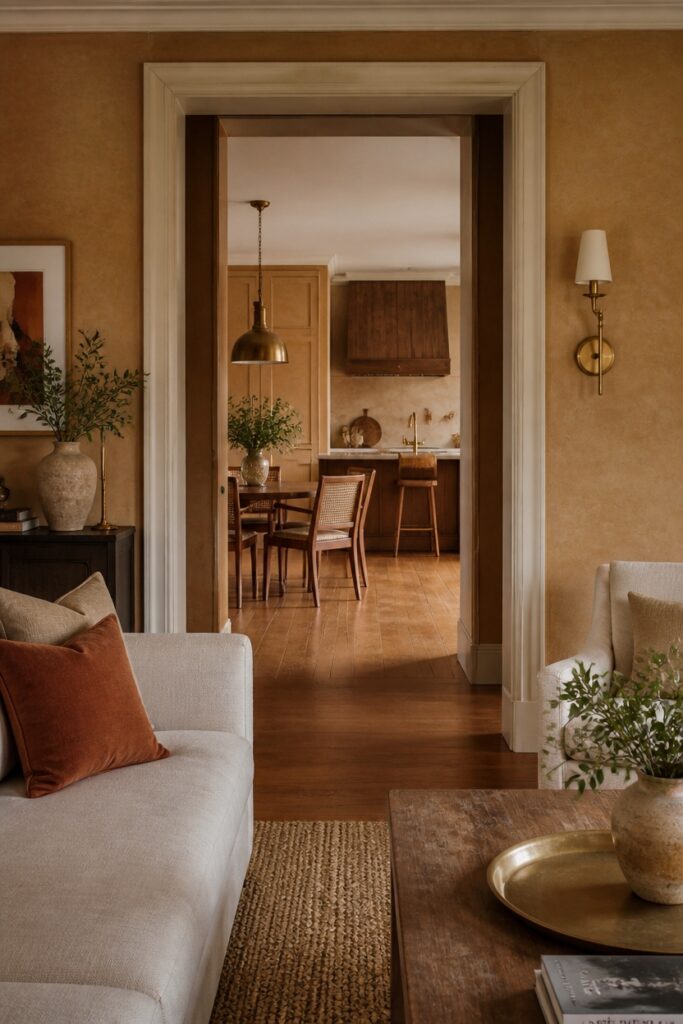
Walking through a home where every room feels like its own separate world can be surprisingly exhausting. The eye never gets to rest, and the overall effect is one of visual noise rather than calm.
Color, materials, and style can quietly stitch these spaces together, turning isolated pockets into rooms that actually speak to one another.
Start by choosing two or three base colors that will travel throughout your home. These aren’t meant to dominate every wall, but rather to appear in shifting proportions from room to room. A deep green might anchor the living room as a painted accent, then resurface as a textile pattern in the bedroom, and finally appear as a ceramic glaze in the kitchen.
Materials work in much the same way. Repeating wood tones, metal finishes, or stone textures at doorways and other transition points creates subtle continuity. Think of these layered elements as bridges that your eye crosses without even noticing, smoothing the journey from one space to the next.
Before committing to any scheme, take time to understand your particular layout. Open-concept homes demand different strategies than traditional boxed-off rooms, and a long railroad apartment presents its own unique challenges.
Reading your floor plan accurately is what separates cohesive environments from ones that merely try hard.
Assess Your Layout Type First (Open-Plan vs. Separate Rooms)
How a home is structured, whether it features open-plan living or distinct, separated rooms, determines which color and style strategies will work best. Open-plan spaces require cohesive color palettes that flow continuously, such as warm neutrals throughout kitchens, dining areas, and living rooms. Separate rooms allow bolder choices, letting each space have its own accent wall or dominant color. A bedroom might feature deep blue while an adjacent office uses warm gray.
Layout type also affects material selection: open-plan benefits from consistent flooring, while separate rooms tolerate varied textures and finishes without visual disruption.
Build a Colour Palette That Travels Through Your Home
Once a homeowner understands whether their space functions as open-plan or separate rooms, selecting colors that work across multiple areas becomes the next step. A unified palette uses two to three base colors, such as warm whites, soft grays, or muted beiges, repeated throughout the home. These anchors create visual continuity, preventing jarring shifts between spaces.
Accent colors, perhaps sage green or warm terracotta, appear in multiple rooms through artwork, textiles, or furnishings rather than walls. This approach maintains cohesion while allowing individual rooms distinct character through varying intensities and complementary hues.
Stack Materials Where Rooms Meet
Changes between spaces gain visual weight and intentional design through layered materials at boundaries. Where a kitchen meets a living room, combining flooring types creates definition, such as tile shifting to wood or carpet. Layering a backsplash material behind an open shelving unit adds depth and visual interest.
Using trim, baseboards, or edge banding in contrasting finishes frames changes effectively. Material stacking: stone, wood, metal together, establishes clear zones without walls. Doorways benefit from layered headers and frames in complementary materials.
This approach maintains visual continuity while acknowledging functional differences between adjacent spaces, creating intentional architectural moments throughout the home.
Use Flooring to Create Visual Flow
Flooring serves as a foundational tool for guiding the eye and movement through connected spaces, extending the visual organization established by layered materials at room boundaries. Continuous flooring, such as light oak or concrete, unifies adjoining rooms by eliminating visual interruption. Transitional strips, including metal or wood thresholds, define boundaries while maintaining flow.
Alternating flooring patterns, like tile in kitchens and wood in living areas, create distinct zones without fragmentation. Consistent color palettes across different flooring materials strengthen connection. Runners or area rugs define pathways, directing movement through spaces while anchoring furniture groupings and reinforcing the overall design continuity.
Choose Accent Colours to Connect Every Room
How can a single colour unify distinct spaces without creating monotony? Selecting accent colours strategically ties rooms together while maintaining visual variety.
A homeowner might choose deep teal for kitchen cabinets, then repeat it in living room throw pillows and bedroom artwork. This approach creates connection through intentional repetition rather than uniform painting.
Accent colours work best when applied to different elements across rooms, such as textiles, accessories, and architectural features. Limiting a palette to two or three coordinating colours prevents visual chaos.
Warm neutrals paired with one bold colour provide cohesion throughout open-concept homes, allowing each space distinct character while maintaining overall design continuity.
Find Your Design Signature (Then Use It Everywhere)
Beyond selecting individual accent colours, homeowners benefit from identifying a personal design signature, a distinctive style or pattern that reflects their aesthetic preferences and repeats throughout the home. This signature might include geometric patterns, botanical prints, or specific material combinations like natural wood and metal.
Once established, applying this signature consistently across rooms creates visual continuity and coherence. For example, a homeowner favoring mid-century modern aesthetics could incorporate tapered furniture legs, warm wood tones, and retro-inspired accessories in bedrooms, living areas, and kitchens. Repeating these elements unifies separate spaces, establishing a recognizable identity throughout the entire home while maintaining individual room functions.
Coordinate Furniture and Fixtures Across Doorways
Most doorways function as visual thresholds between rooms, making the furniture and fixtures positioned near them particularly important for overall home cohesion. Coordinating pieces across these links requires attention to several elements.
Console tables, mirrors, and lighting fixtures should share consistent finishes, whether brass, chrome, or matte black. Wood tones need matching between adjacent spaces: warm oak in one room, cool walnut in another, creates visual discord. Hardware on nearby cabinets and doors should coordinate in style and material.
Paint colors flanking doorways benefit from thoughtful selection, using complementary or harmonious palettes. These coordinated details establish visual continuity, reducing fragmentation throughout interconnected living spaces.
Frequently Asked Questions
How Do I Connect Rooms When My Existing Furniture Has Conflicting Styles and Colors?
One can bridge conflicting styles by introducing neutral intermediary pieces in shared spaces. Strategic use of consistent flooring, cohesive color palettes through accents, and complementary accessories gradually harmonizes disparate furniture styles across adjoining rooms.
What’s the Best Way to Transition Between Bold Accent Colors in Adjacent Rooms?
Clashing hues need not clash—they harmonize when one employs strategic neutrals. Designers recommend placing soft, muted tones in intermediary spaces like hallways or doorways. This buffer zone allows bold accent colors to coexist without visual discord, creating sophisticated flow.
Should I Use the Same Flooring Material Throughout My Entire Home for Continuity?
Using identical flooring throughout creates visual continuity, though one need not apply this universally. Strategic material changes can define spaces while maintaining flow. Shifting between complementary materials in adjacent rooms often achieves balance between distinction and cohesion effectively.
How Can I Create Flow in Homes With Oddly-Shaped or Irregularly-Sized Connecting Rooms?
One can establish visual continuity by repeating color palettes across spaces, using complementary materials that shift naturally between rooms, and strategically placing furniture to guide movement through awkward layouts and varying dimensions.
What Lighting Choices Help Unify Disconnected Spaces Through Color and Material Consistency?
Research shows 68% of homeowners report improved spatial cohesion after implementing consistent lighting. Unified spaces benefit from matching color temperatures across rooms—warm 2700K tones in living areas, cool 4000K in kitchens—while material-reflective fixtures echo flooring and furnishings, creating seamless visual shifts.
Conclusion
Connecting rooms requires careful consideration of color, materials, and style choices. A unified palette produces purposeful, pleasing progression between spaces. Strategic placement of accent colors, materials, and consistent flooring facilitates flow and definition. Coordinated furniture and fixtures further reinforce relationships between rooms. By building these binding elements—color, materials, and signature style—homeowners create cohesive, connected living spaces that feel harmonious and intentional throughout.