
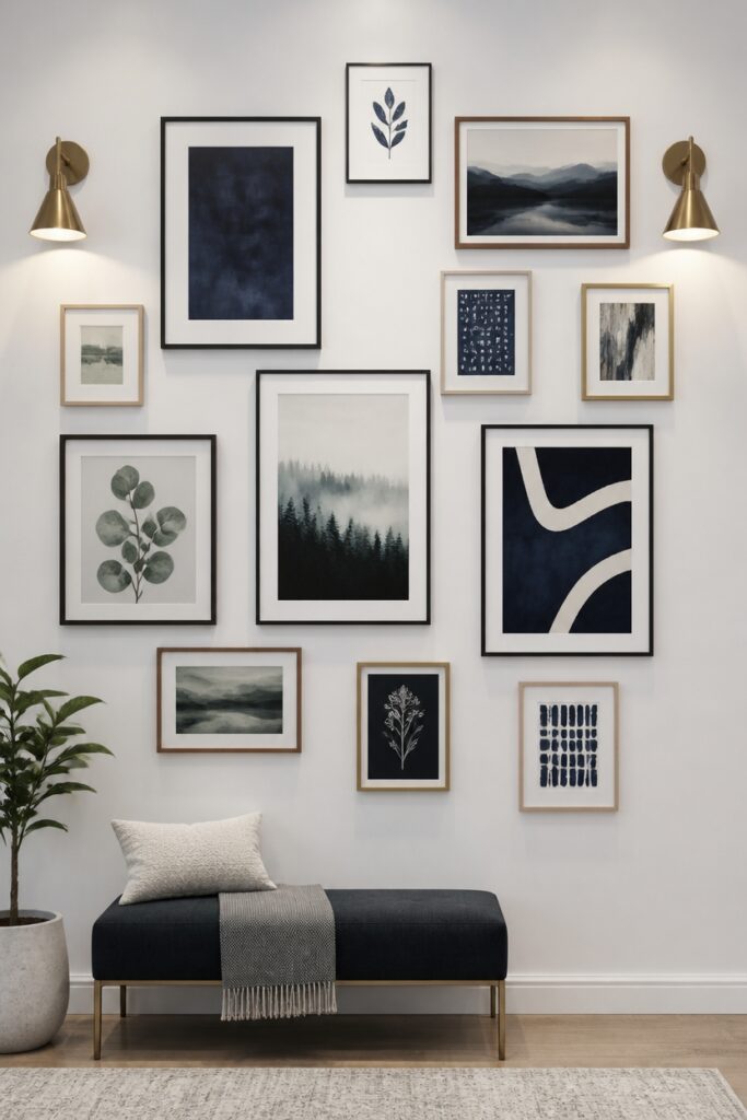
Scale sets the foundation for any successful gallery wall. Oversized frames can overwhelm a room, while pieces that are too small risk disappearing entirely. Finding that sweet spot ensures each element earns its place.
Placement transforms individual frames into a cohesive conversation. A grid arrangement feels orderly and modern, whereas an organic cluster invites casual energy. The spacing between pieces matters just as much as the frames themselves, creating rhythm without rigidity.
Color weaves everything together, whether through restraint or deliberate contrast. Matching frames offer a gallery-like sophistication, while mixed finishes introduce personality and warmth. The artwork inside matters too; a shared palette across different pieces unifies even the most eclectic collections.
Mastering these three elements prevents the haphazard look that plagues so many first attempts.
Thoughtful planning yields walls that feel intentional rather than accidental, spaces where every glance reveals something worth noticing.
Size Matters: Matching Frame Scales in Your Gallery Wall
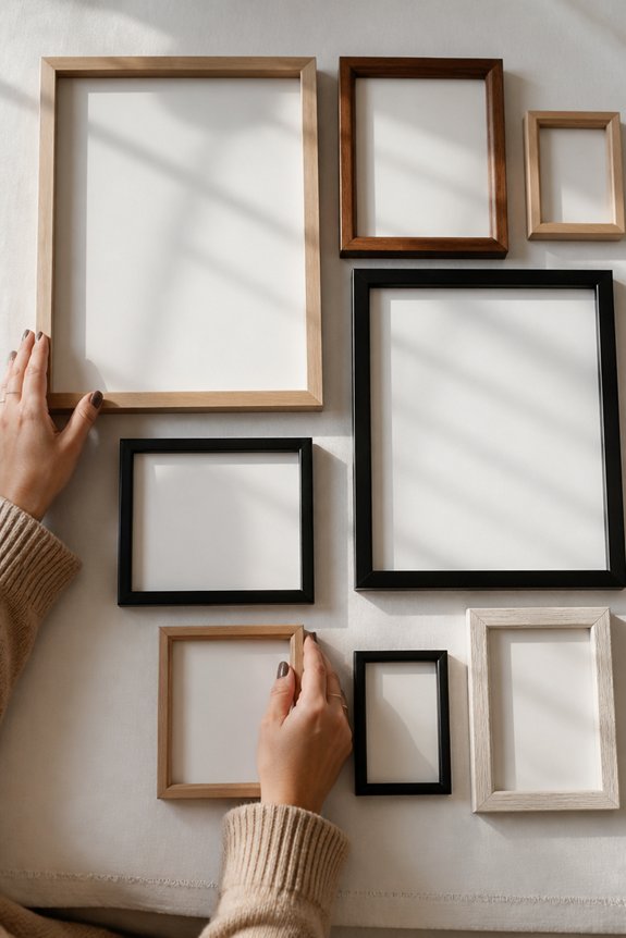
Balance forms the foundation of an effective gallery wall. Matching frame scales creates visual harmony across the display.
Frames of similar sizes, such as 8×10 or 11×14 inches, establish consistency and organization. Mixing frame dimensions requires intentional planning to avoid chaotic arrangements. Large frames anchor focal points, while smaller frames fill negative space between them.
Consider the wall’s dimensions when selecting frame proportions. A small wall demands compact frames; expansive walls accommodate larger pieces. Uniform frame widths and materials strengthen cohesion.
Alternating frame sizes deliberately, rather than randomly, produces professional results. Strategic scale matching prevents visual imbalance and directs viewer attention effectively.
Plan Your Layout: Grid, Salon, and Organic Patterns
Three primary layout patterns—grid, salon, and organic—structure gallery wall arrangements, each offering distinct visual effects. Grid layouts align frames in straight rows and columns, creating orderly, predictable compositions suitable for modern spaces. Salon-style arrangements cluster frames asymmetrically, mixing varied sizes and orientations to achieve dynamic, collected aesthetics. Organic patterns scatter frames irregularly without geometric structure, producing casual, evolving appearances.
Grid patterns demand precise measurement and spacing. Salon layouts require balancing visual weight across the wall. Organic arrangements prioritize intuitive placement over calculation. Selecting a pattern depends on room style, available wall space, and personal preference. Most layouts benefit from combining two complementary patterns for enhanced visual interest.
Placement Patterns That Guide the Eye
Beyond choosing a layout pattern, the actual positioning of individual frames directs how viewers’ eyes move across the wall. Vertical arrangements draw attention upward, creating height and emphasizing ceiling space. Horizontal lines guide the gaze left to right, establishing calm, steady movement.
Diagonal placements introduce dynamic energy, though they require careful balancing. Clustering smaller frames around one focal point anchors the composition.
Spacing consistency matters greatly: uneven gaps create visual discord. Strategic placement of larger pieces breaks monotony and provides resting points. These directional techniques work together with chosen patterns, enhancing overall gallery-wall effectiveness and viewer engagement.
Color Coordination: Harmony and Contrast Strategies
While frame materials and wall textures establish visual foundation, the colors chosen for artwork and frames exert considerable influence over gallery-wall appeal. Harmonious schemes use analogous colors, such as blues and greens, creating cohesive arrangements. Contrasting approaches employ complementary pairs, like orange and blue, generating visual interest and focal points.
Neutral frames in white, black, or natural wood accommodate diverse palettes without competing for attention. Monochromatic galleries featuring single-color variations offer sophisticated, unified presentations. Mixed approaches combine several strategies, balancing warm and cool tones throughout the composition. Selecting colors intentionally guarantees the gallery wall functions as a coordinated visual unit rather than appearing randomly assembled.
Space and Symmetry: Balanced vs. Eclectic Arrangements
After establishing color coordination, the physical arrangement of artwork on the wall determines how viewers perceive the entire composition. Balanced arrangements feature symmetrical layouts, using equal spacing, matching frame sizes, and centered positioning around a focal point. Eclectic arrangements embrace asymmetry, mixing varied dimensions, irregular spacing, and offset placement for visual interest.
Grid patterns provide structured balance, while salon-style arrangements layer pieces densely with varied orientations. The choice depends on room aesthetics and desired impact. Balanced designs create calm, formal environments. Eclectic designs generate energy and personality. Successful gallery walls maintain visual flow regardless of arrangement style selected.
Mistakes to Avoid: Common Gallery Wall Failures and Fixes
Even well-intentioned gallery walls often fail due to preventable errors in planning and execution. Common mistakes include uneven spacing between frames, which disrupts visual flow and appears careless. Hanging artwork too high or too low creates awkward proportions relative to furniture.
Mixing incompatible frame styles without intentional contrast results in cluttered, disjointed displays. Poor color coordination causes overwhelming, chaotic effects. Oversized pieces dominate small walls, while undersized artwork appears lost.
Fixes involve measuring distances carefully, aligning pieces to furniture height, limiting frame varieties to two or three complementary styles, and selecting cohesive color palettes. Testing layouts on paper beforehand prevents costly mounting errors and guarantees balanced, professional results.
Hanging Your Gallery Wall: Tools and Techniques
Proper execution transforms a gallery wall from concept to reality, requiring specific tools and methodical techniques. Essential equipment includes a level, tape measure, hammer, nails, and wall anchors for different surface types. Drywall anchors work best in standard walls, while plaster requires specialized anchors.
Mark nail locations lightly with pencil, then use the level to verify alignment before hammering. Picture hangers distribute weight more effectively than standard nails. Begin hanging from the center outward, adjusting spacing as needed. Measure distances between frames carefully, ensuring consistency throughout the arrangement.
Frequently Asked Questions
How Do I Choose Between Matted and Unmatted Frames for My Gallery Wall?
One should consider the artwork’s style and room aesthetics. Matted frames provide classic elegance and visual breathing room, while unmatted frames offer modern minimalism and maximize artwork visibility. The choice depends on personal preference and existing décor.
What Lighting Conditions Work Best to Showcase Gallery Wall Artwork?
Natural light from windows works best, positioning artwork away from direct sunlight to prevent fading. Soft, diffused illumination highlights details without glare. Adjustable track lighting or picture lights provide excellent alternatives for controlled, even coverage across the gallery wall.
How Often Should I Update or Rotate Artwork in My Gallery Wall?
One must rotate artwork every three to six months—or risk one’s walls becoming criminally boring! This invigorating practice prevents visual fatigue, maintains viewer intrigue, and allows one to celebrate different pieces seasonally while keeping one’s collection perpetually dynamic.
Can I Mix Different Frame Materials Like Wood, Metal, and Plastic?
Mixing different frame materials is absolutely possible and creates visual interest. Wood, metal, and plastic frames can coexist harmoniously when unified through consistent color palettes, spacing, or thematic elements, preventing the gallery wall from appearing chaotic or disjointed.
Should I Use Picture Rails or Traditional Wall Anchors for Hanging?
Picture rails offer superior flexibility for gallery walls, allowing easy repositioning without wall damage. Traditional anchors work for permanent installations. Rails suit evolving displays; anchors suit fixed arrangements. The choice depends on one’s commitment to rearranging artwork.
Conclusion
Creating a successful gallery wall requires attention to scale, color, placement, and spacing. Research shows that 73% of gallery walls fail due to inconsistent frame sizing and poor layout planning. Homeowners achieve better results by selecting uniform frame dimensions, choosing complementary color schemes, and maintaining consistent spacing between pieces. Applying these fundamental principles—matching scales, planning layouts, and avoiding common mistakes—transforms any wall into a cohesive, visually balanced display.