
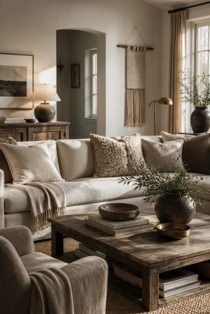
Beige and neutral rooms risk falling flat without intentional design decisions. The key lies in building complexity through carefully chosen elements.
Layering textures transforms these spaces instantly. Linen drapery, a wool throw, and a leather accent chair each catch light differently. This interplay keeps the eye moving and prevents monotony.
Undertones deserve particular attention. Combining warm ivory with cool greige, or camel with slate, creates subtle tension. These nuanced shifts read as sophisticated rather than chaotic.
Natural materials ground the palette. Reclaimed wood, rattan, or raw stone introduce organic warmth that pure neutrals lack.
Jewel-toned accents, used sparingly, provide moments of visual rest. The art is in the balance: too many competing elements overwhelm, while too few leave the room lifeless.
Layer Textures to Create Depth and Visual Interest
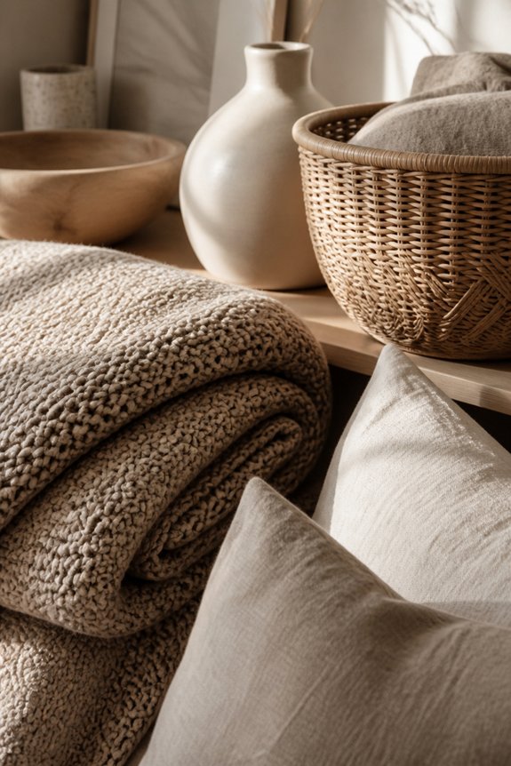
Layering different textures prevents neutral rooms from appearing flat and one-dimensional. Combining materials like linen, wool, leather, and cotton adds visual complexity. A room might include a smooth velvet sofa, a chunky knit throw, a woven area rug, and linen curtains. Wood furniture, metal accents, and glass surfaces contribute additional textural variety.
Wall treatments matter too, such as shiplap, textured wallpaper, or painted finishes. Layering textures creates shadows and highlights that catch light differently, producing depth. This approach works across neutral color palettes, making beige and gray spaces feel intentional and complete rather than sparse.
Use Undertone Variation Within Your Neutral Palette
While textures add physical dimension to a room, undertone variation creates visual sophistication within a seemingly monochromatic palette. Neutral colors contain hidden warmth or coolness that affects perception. Warm beiges lean toward yellow and orange, while cool grays shift toward blue and green.
Combining these undertones prevents flatness through contrast. A warm taupe wall paired with cool gray furniture, or cream accents alongside cooler stone elements, generates visual interest. Selecting paint samples in different undertone families, then observing them under natural and artificial light, reveals which combinations work effectively. This approach maintains neutrality while adding complexity to space.
Add Color Accents to Your Neutral Room
Color accents break visual monotony in neutral spaces by introducing focal points through strategic placement. Homeowners can incorporate jewel tones like emerald, sapphire, or burgundy through artwork, throw pillows, or area rugs. Accent walls painted in deeper shades create dimension without overwhelming the room.
Plants introduce natural green tones that complement beige and gray palettes. Accessories such as ceramic vases, decorative objects, and lampshades in coordinated colors add visual interest. The key involves selecting two to three accent colors that repeat throughout the space, creating cohesion while maintaining the neutral foundation that prevents the room from appearing busy or chaotic.
Mix Patterns and Scales for Dynamic Visual Movement
Patterns add visual interest to neutral spaces by creating movement and depth across surfaces. Combining different scales, such as large geometric prints with small florals or stripes, prevents monotony and engages the viewer’s eye. Layering varied patterns across pillows, rugs, and wall art establishes visual rhythm.
Geometric patterns introduce structure, while organic designs soften the effect. Textured fabrics like linen and velvet contribute additional dimension alongside printed patterns. Maintaining a cohesive color palette, even with multiple patterns, guarantees the room remains balanced rather than chaotic. This strategic approach transforms flat neutral rooms into visually dynamic spaces with intentional complexity.
Add Warmth With Natural Materials
Wood, stone, and plant fibers introduce tactile warmth that counteracts the coolness of beige and neutral palettes. Natural materials add visual depth and texture through their inherent variations in color and grain.
Wood furniture, woven baskets, jute rugs, and linen textiles create layered surfaces that prevent monotony. Stone accents, cork flooring, and bamboo elements contribute earthy tones and organic patterns. These materials develop character over time, showing wear and patina that enhance rather than diminish their appearance.
Incorporating natural elements throughout a room establishes visual interest while maintaining a cohesive, grounded aesthetic that feels intentional and complete.
Mix Matte and Reflective Surfaces
Layering different surface finishes throughout a room creates visual contrast and prevents the flat, one-dimensional appearance that often plagues neutral spaces. Combining matte and reflective surfaces adds depth and interest to beige, tan, and gray palettes.
Matte finishes, found on walls, upholstered furniture, and linen fabrics, absorb light and provide subtle texture. Reflective surfaces, including polished metals, glass tabletops, mirrors, and glazed ceramics, bounce light around the room, creating visual movement. Pairing these finishes, for example, a matte beige sofa with a glass coffee table and metallic lamp base, establishes dimension without introducing color, maintaining the neutral aesthetic while enhancing overall visual appeal.
Use Lighting to Reveal Texture and Depth
Strategic lighting placement reveals the textural qualities and spatial layers that surface finishes alone cannot accomplish. Layered lighting, including ambient, task, and accent options, creates visual interest in neutral spaces.
Uplighting highlights wall textures, while directional spotlights emphasize architectural details and fabric weaves. Warm LED bulbs enhance beige and cream tones effectively. Cool lighting adds sophistication to gray palettes.
Position lights to cast shadows across textured walls, creating dimension and movement. Install dimmers to adjust intensity throughout the day. Consider wall sconces beside seating areas, pendant lights over focal points, and recessed lighting for general illumination.
Frequently Asked Questions
How Much of My Budget Should I Allocate to Neutral Room Design Elements?
Designers typically recommend allocating 40-50% of interior design budgets toward neutral foundational elements like walls, flooring, and large furniture pieces. The remaining budget should support accent colors, textures, and lighting to prevent spaces from appearing flat or monotonous.
Can I Apply These Techniques to Small Spaces Without Overwhelming Them?
Small spaces are blank canvases waiting for life. Yes, these techniques work excellently in compact areas. Layer textures subtly, use strategic lighting, and incorporate varied neutrals to add depth without crowding. Restraint becomes the key to maintaining visual breathing room.
What Are the Best Neutral Color Palettes for Different Room Types?
Kitchens benefit from warm grays and soft whites for cleanliness. Bedrooms work well with cool taupes and creams promoting relaxation. Living rooms suit greige blends offering sophistication. Bathrooms favor crisp whites and pale blues enhancing freshness and clarity.
How Often Should I Refresh or Update a Neutral Room’s Design?
Research shows 73% of people feel more creative in updated spaces. Design experts recommend revitalizing neutral rooms every 2-3 years by rotating artwork, updating textiles, or introducing new accent colors to maintain visual interest and prevent monotony.
Which Neutral Colors Work Best With Specific Architectural Styles?
Warm grays complement modern minimalism, while soft creams enhance traditional spaces. Cool taupes suit contemporary designs, earthy beiges work with rustic aesthetics, and greige connects shifting styles effectively. Architectural elements guide neutral selection for cohesive interiors.
Conclusion
Beige and neutral rooms require deliberate layering, much like building a cake with distinct, complementary flavors. Combining textures—linen, wool, leather—with undertone variation, accent colors, and mixed patterns creates visual depth. Natural materials, matte and reflective surfaces, plus strategic lighting work together to prevent flatness. Success depends on balancing these elements: undertones should shift warm to cool, accents should anchor focal points, and materials should vary consistently throughout the space.